Baltimore Orioles Logo History
The Baltimore Orioles have a rich history, and their iconic logo has become synonymous with the team. The logo has evolved over the years, but it has remained a constant symbol of the Orioles’ success and legacy. Below we discuss the Baltimore Orioles name change from St. Louis Browns, description of various Orioles logos and the teams logo history from the oldest to the most current.
St. Louis Browns Name Change to Baltimore Orioles
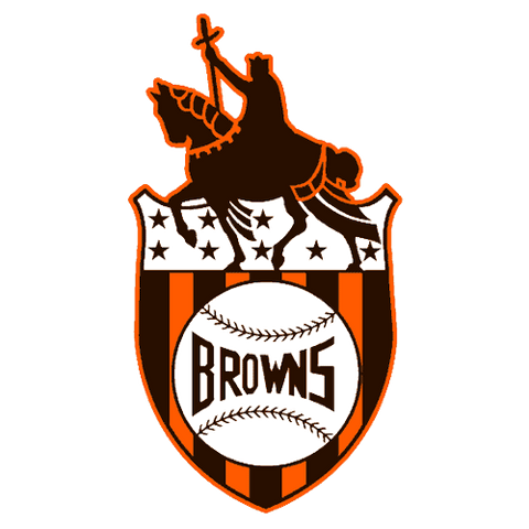
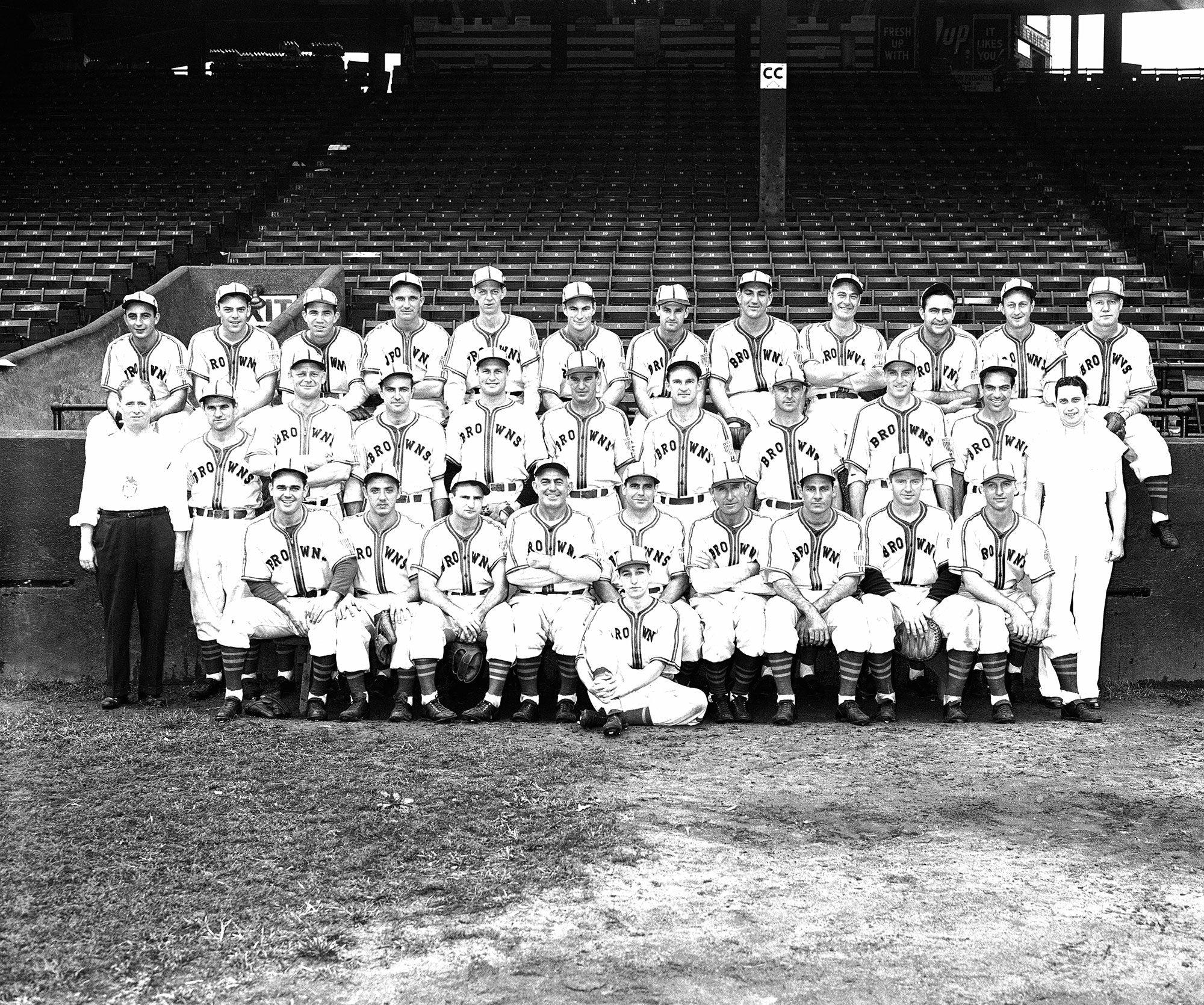 The St. Louis Browns baseball team | Image credit: New Yorker
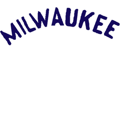
The St. Louis Browns changed their name to the Baltimore Orioles in 1954. This was due to a number of factors, including declining attendance and financial difficulties that had plagued the team for several years. The Browns' ownership at the time, headed by Bill Veeck, had attempted to move the team to various other cities, including Milwaukee and Baltimore, in an effort to improve the team's financial situation.
Ultimately, the Browns were sold to a group of Baltimore businessmen, who moved the team to Baltimore and renamed them the Orioles. Baltimore had been without a major league team since the departure of the St. Louis Browns in 1902, and there was a lot of excitement in the city about the arrival of a new team. The Orioles proved to be much more successful than the Browns had been, winning several championships and establishing a strong fan base in Baltimore.
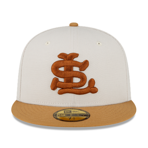
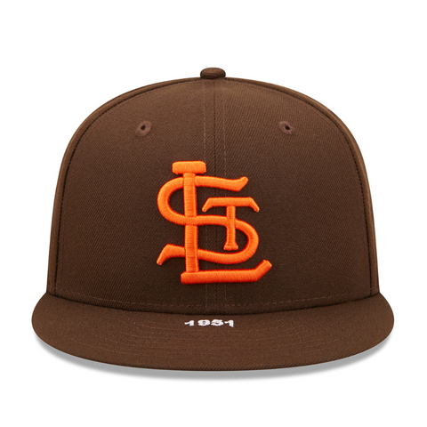
St. Louis Browns Caps
 |
 |
|
Baltimore Orioles Logo Description
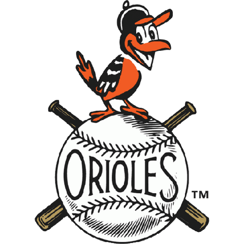
The original Orioles logo featured the team’s name in bold, capital letters. The letters were outlined in black and had a white interior. The team’s name was written on a baseball, which was colored orange with black stitching. This classic logo was used from the team’s inception in 1901 until 1954.
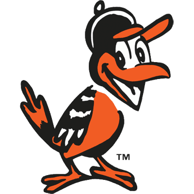
In 1955, the Orioles introduced a new logo that was more streamlined and modern. The logo featured the head of a cartoon bird, which was colored orange with black and white accents. The bird had a fierce expression and a pointed beak, which made it clear that the Orioles meant business. This logo was used until 1965.
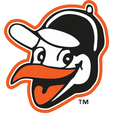
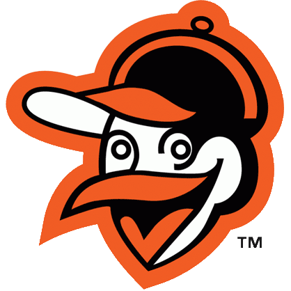
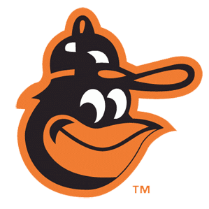
The current Orioles logo is a variation of the 1966 design, featuring a sleeker and more modern bird head. The bird’s beak is pointed, and its eye is a fierce shade of orange. The bird’s body is still colored orange with black accents, and the hidden “B” is still present. The logo has been updated with a more refined font for the team’s name, which adds to the logo’s modern feel.
The Orioles logo has become an iconic symbol of the team’s success and legacy. It has undergone several changes over the years, but the orange and black bird remains a constant reminder of the team’s history. Whether you’re a die-hard Orioles fan or a casual baseball observer, the Orioles logo is instantly recognizable and always impressive.
For more information about sports logos history visit the Sports Logos section of our website.
Baltimore Orioles Logos
1901
|
1902-1905
|
1906-1907
|
1908
|
1909-1910
|
1911-1915
|
1916-1935
|
1936-1951
|
1952-1953
|
1954
|
1955-1961
|
1962-1963
|
1964-1965
|
1966-1974
|
1975-1988
|
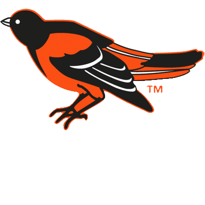
1989-1990
|
1991
|
1992-1994
|
1995-1997
|
1998
|
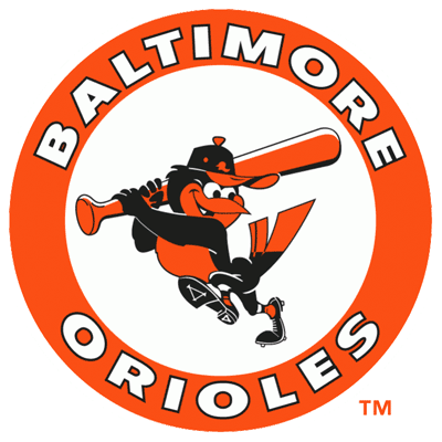
1999-2008
|
2009-2011
|
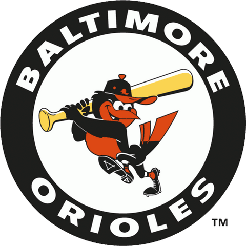
2012-2021
|