
Houston Astros Logo History
The Houston Astros have had several logos throughout their history. Each logo change has reflected the team's evolving identity and helped establish its brand as one of the premier franchises in Major League Baseball. Here is a brief rundown of each logo change:
1962-1964 (Colt .45s): The Houston Colt .45s, as the team was originally known, had a logo featuring a white horseshoe with a red star and a blue background. This logo was only used for two seasons.
1965-1993: The team changed its name to the Astros in 1965 and introduced a new logo that featured a white star on a blue background. This logo was used during the team's time at Colt Stadium and the Astrodome.
1994-1999: In 1994, the Astros updated their logo to a blue, white, and orange shooting star. This logo was used during the team's transition to their new home at Minute Maid Park.
2000-2012: In 2000, the team updated their logo again to a more stylized version of the shooting star, with a brighter blue and orange color scheme. This logo was used during a period of success for the team, including several playoff appearances and their first World Series championship in 2017.
2013-present: The current Astros logo, introduced in 2013, features a white star with an orange, blue, and silver color scheme. This logo has a more modern, streamlined look and is the team's primary logo today.
The above is a summary of Houston Astros logos; not all logos were highlighted. A few other distinguishable and fan-favorite logos are mentioned below.
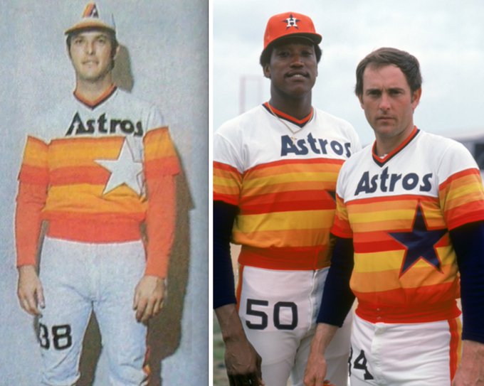
The Houston Astros used their "Prototype" logo from 1965 to 1969. The Prototype logo features a stylized star with a blue and orange colorway in three-dimensional letters. The blue and orange colorway intends to evoke images of the night sky and the sunrise, respectively. The logo was a prototype for the early Houston Astros rainbow uniform.
The Houston Astros used their "Apollo" logo from 1971 to 1993. The logo features a stylized representation of the Apollo 11 mission patch with an orange shooting star and the word "Astros" written in blue letters underneath. The design is meant to evoke images of the team's connection to Houston and its association with the American space program. The orange shooting star represents the team's ambition and drive, while the blue lettering helps to balance the design. Overall, the "Apollo" logo is a unique and memorable design that effectively communicates the team's space-oriented identity.
Be sure to check out Sports Logos for more new & old sports logos.
Houston Astros Logo (Current & Historic

|
|
2000 – 2010
|
1995 – 1999
|
1994
|
1977 – 1993
|
1965 – 1976
|
1962 – 1964
|